Alerting, Monitoring, and Diagnostics
Inevitably your software will fail.
Requirements around detection and diagnosing of software problems are often neglected. At best they are the last thing considered and are reactionary. Hence, solutions can be muddled and confusing; often unclear about which problem they are trying to address.
Furthermore, the direction is often dictated by the companies choice of Dashboard/Alerting tooling. Rather than engineering having the time and freedom to consider what they need.
In this post, I will run through the differences between Alerting, Monitoring, and Diagnostics of software systems looking at good practices and potential pitfalls.
Alerting
“It’s a dangerous world, man. You’ve gotta keep your eyes and ears peeled and be on the alert all the time.”
Vinnie Paul
Imagine, it’s half past six on a Saturday morning and a critical software system starts to deteriorate, by nine this has escalated into a full outage. However, also consider another less critical system that starts to deteriorate but continues to run.
The purpose of alerting is to give appropriate notifications to those who support software systems. Or to put it another way, what do you want to know about in the middle of the night?
Consequently, having levels of alerting is essential if you don’t want to be woken up for something mundane. A typical example of alert levels would be low, medium, and high. With only the latter triggering the nocturnal surprise.
Furthermore, it is also important to be able to send alert messages to multiple sources. This ‘fanning’ of messages allows the alert to be sent to multiple mediums (e.g. Slack, email, SMS) and potentially to different groups of people (e.g. engineers, service support).
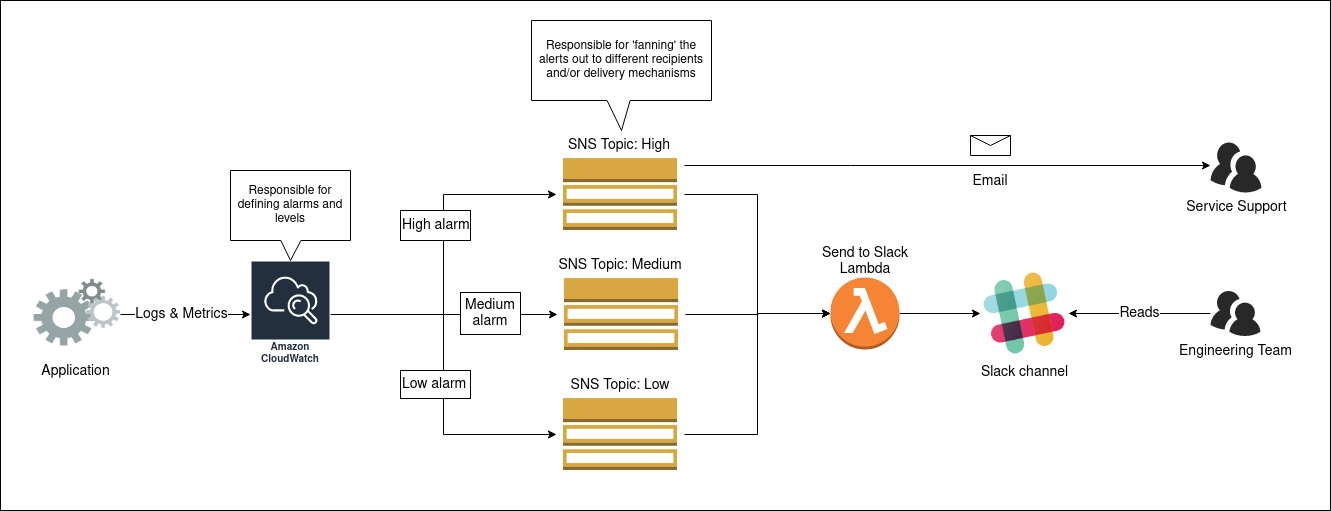
The diagram below illustrates a simple but effective alerting system that I have seen in use for a product hosted on AWS. The definition of the alerting alarms is handled in CloudWatch, these can then be assigned a level by attaching the appropriate SNS topic (High, Medium or Low). These topics send the alarm out to any number of interested subscribers by various mechanism (i.e. email, Slack). Splitting topics by alerting level enables the subscribers choose the level of alerting ‘noise’ they desire.
Monitoring
I know enough of the world now to have almost lost the capacity of being much surprised by anything
Charles Dickens, David Copperfield
The central purpose of monitoring is to clearly show if your applications are healthy. I’m referring here to the information you glance at to see if everything is okay. Typically, this is the dashboard you have displayed in the office.
Primarily, this dashboard should be driven by the same alerting process I described in the previous section. Colour can be an effective communication aid for monitoring dashboards. Typically I’ve seen critical alerts use hues of red to draw the observers attention. Conversely, greens are used when everything is okay.
Furthermore, these dashboards may also contain contextual information to help the viewer make sense of the alerts. For example, it might be useful to show traffic levels or status of an underlying third party system. However, it is important to remember that less is more with monitoring dashboards. It is not about the detail, it is a call to action to investigate the problem.
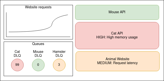
The diagram above shows a sketch I’ve made to illustrate what a clear and informative monitoring dashboard might look like. Something is clearly wrong with the Cat API, perhaps this is causing the latency with the Animal Website? Oh wait, the website requests seem to have gone up quite a bit, perhaps that is worth investigating?
It is worth mentioning that many leading tools on the market are not tailored for making monitoring visuals. Products such as Kibana, Graphana, and Cloudwatch Dashboards are all based around making dashboards for a defined time frame (such as last 3hrs, last day etc). There’s usually an option to adjust this period in the top corner of the screen. So, why is this a problem?
Firstly, some of the data is pushed real time to the dashboard rather than being queried for a particular time frame. This makes integration with alerting data sources problematic, if not next to impossible with these tools.
Secondly, the context data that you might want to display might not be as simple as a single time period. For example, what if for one graph you need to see the last three hours of data whereas a neighbouring graph you want to see the data for the same period yesterday.
For these reasons, I’ve often seen teams resort to using Open Source tools like Smashing or building their own solutions for clear and informative monitoring.
Diagnostics
“It’s a funny thing about looking for things. If you hunt for a needle in a haystack you don’t find it. If you don’t give a darn whether you ever see the needle or not it runs into you the first time you lean against the stack.”
P.G. Wodehouse
Imagine you’ve had an alert or your monitoring dashboard has turned a shade of rouge. You know that one of your systems is failing, but what is causing it? This is where detail becomes important, you need as much as possible to help you diagnose and resolve the issue. Sources of diagnostic information include application logs, instrumentation metrics from infrastructure, and logs of external services (such as Web Application Firewalls and API Management).
However, be aware that there can be too much detail to sieve through, especially in the middle of the night! It is important to just log and capture information that is likely to be useful. Consider how ‘chatty’ your logs are, will they make it easier or harder to find that needle in the haystack? Another consideration is how long you retain your diagnostic information for, holding logs and metrics longer help spot long-term patterns, but at a higher cost and more data to search through. It is important to find the right balance for your team, not just falling back to default positions (e.g. whole organisation stores logs for 12 months).
Tooling wise, diagnostics is the forté of products such as Kibana, Graphana, and Cloudwatch Dashboards. The ability of these products to bring together numerous data sources and build in-depth visualisations based upon time ranges is ideal for supporting diagnostics.
If your system contains many moving parts (i.e. Microservices) it may be worth considering a Distributed Tracing solution, such as Zipkin or AWS X-Ray. These utilise a common identifier for requests through the system, which enables the user interface of these tools to provide timings and points of failure between the various parts of your system.
Conclusion
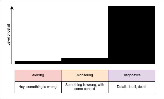
In this post I have covered the differences between Alerting, Monitoring, and Diagnostics on software systems. The diagram below illustrates how the amount of detail increases from Alerting to Monitoring and then surges in the Diagnostics arena.
Each of these use cases have unique requirements that call for different approaches and different tool-sets. But combined together they help to form a coherent picture of the state of a software system.