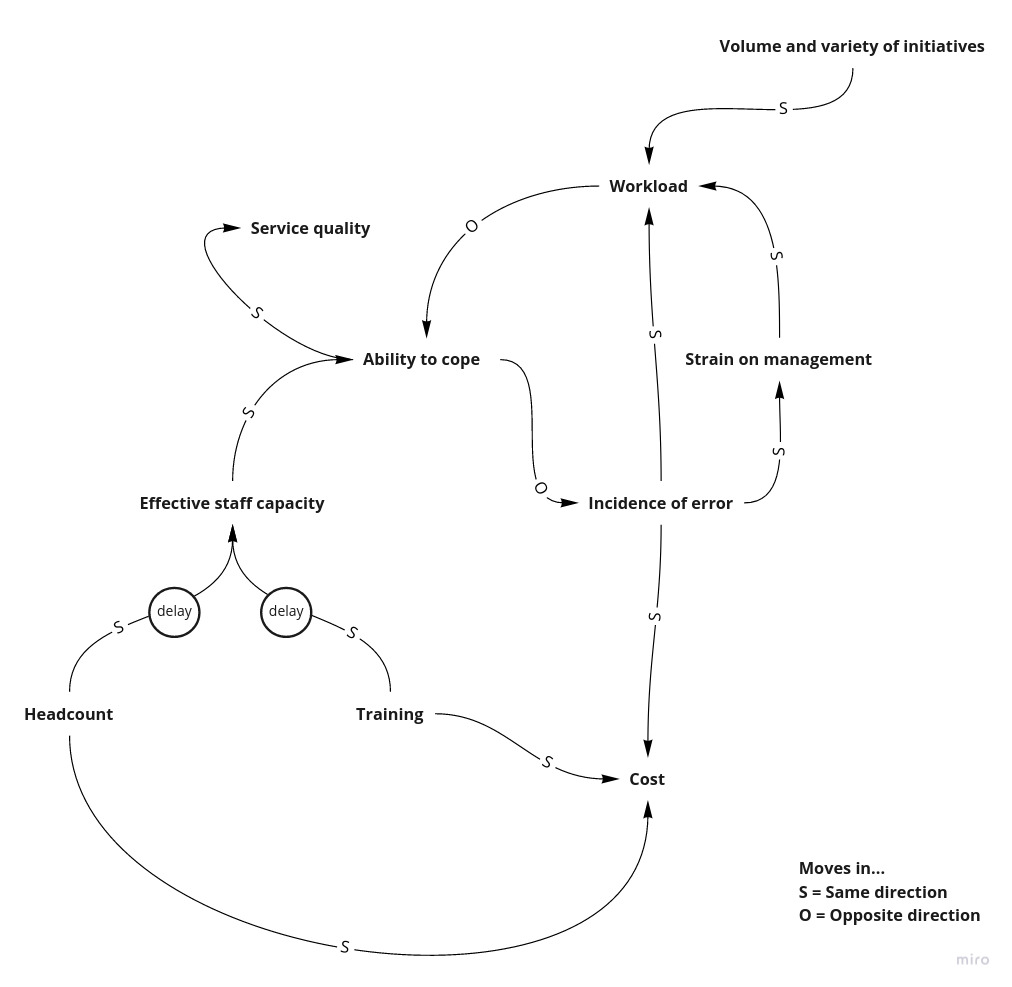
Causal Loop Diagrams: Ability to Cope
This is my favourite diagram at the moment….
I’ve shared it with countless colleagues, as I feel it really demonstrates the vicious circle that many Software Teams/Departments find themselves in.
It is shamelessly copied and adapted from an example in the book Seeing the Forest For the Trees. The example in the book is based upon a back-office function of a financial organisation, yet it shares many of the traits of departments and teams in Software.
This type of diagram is called a Causal Loop Diagram and is used to show the interactions between parts of a system. Each link between elements is annotated with either an S or O. These inform the reader whether the connected elements move in the same (S) or opposite (O) direction.
What is the diagram above conveying to us? If we start from volume and variety of initiatives, when this increases (as often happens in Software) the workload moves in the same direction (S) - it also increases! Consequently, an increase in workload will cause a decrease in the ability to cope, as this moves in the opposite direction (O).
As a result of this the incidence of error will increase, as this moves in the opposite direction of ability to cope. The increased number of errors will cause the strain in management to move in the same direction (increase). Finally, this strain will cause the same direction movement in the workload, thus increasing this further. Which completes this vicious circle that if left unchecked will continue to deteriorate.
There is also an additional information about how staff levels, cost and delays impact this loop externally. Furthermore, it also shows how service quality is impacted by this vicious circle.
The loop that is causing the vicious circle is an example of a reinforcement loop. These types of loop will continue to spin until some action is taken, in this example the influencing factor is the volume and variety of initiatives.
All reinforcement loops can create vicious or virtuous circles, it depends on the influencing factor(s). In our example above, if the volume and variety of initiatives is at a more manageable level it will decrease the workload. This in turn will increase the ability to cope, which will reduce the incidence of errors. For this reason the strain on management will be reduced which then leads to a reduction in workload. We now have a virtuous circle!
Hence, this causal loop diagram illustrates that the flow of work into teams is the most important lever to control both the ability of team members to cope and the sustainability of delivery. This is probably not a surprise to many software teams, but this diagram and causal loop diagrams in general are a great way of illustrating systemic traps that organisations get themselves into.